Moteefe.com | Seller research (UX)
Moteefe was/is a rapidly growing player in the E-commerce Print-on-Demand (POD) space. We enabled entrepreneurs to rapidly set up e-commerce stores to sell into different markets around the world using our products, delivery and customer support systems. In a very short space of time we had grabbed some significant market share from our competitors. However the pressure to keep that market share and provide value and support to our new sellers was always increasing as we scaled.

The problem
While we had scaled incredibly quickly and gained significant market share in the POD space by offering a combination of products that enabled sellers to make a large margin on the selling price as well putting in place a reliable delivery solution, we realised that we had started to lose sellers to some big competitors. The POD space is not unfortunately a very loyal one as it’s a very easy process to set up a store with a competitor and start selling. In fact, sellers would regularly set up multiple stores with platforms like Moteefe to see which ones performed best.
We had two interconnected questions:
Why were we losing sellers and why were we not attracting new sellers?
What did sellers want from their POD e-commerce platform and partner?

Goals & challenges
GOALS
Ultimately this was an exercise to:
Undertake a mixture of qualitative and quantitative research to try and understand our sellers' pain-points and obtain their feedback and insights. We wanted to get a snapshot of what our sellers’ perception of us was in the market.
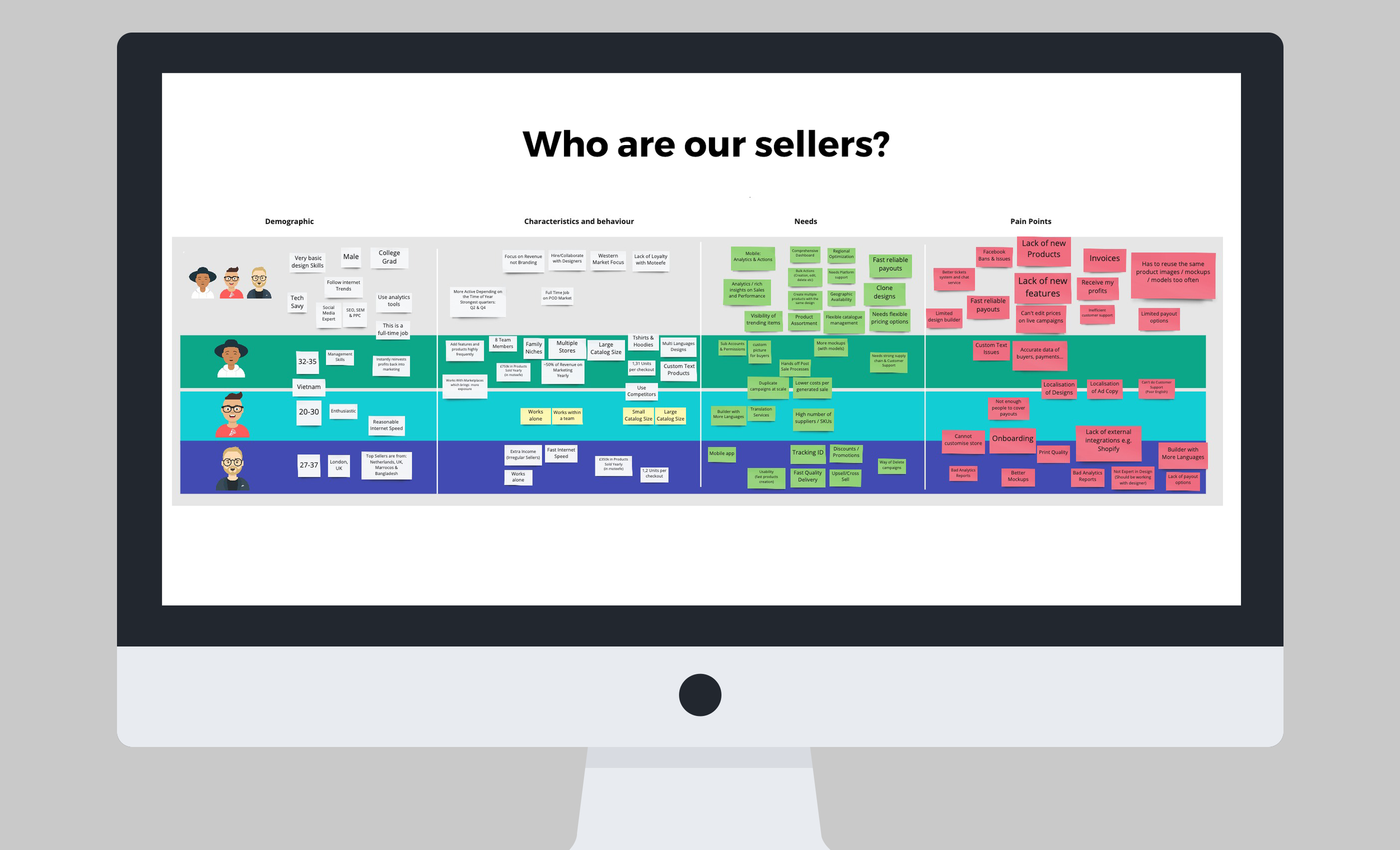
We wanted to use the insights that we gained to further develop our seller personas and map them to nearly all of the different areas of the business including product development, sales, marketing and help channels and platforms.
We wanted to see if we could unearth any other potential weaknesses and friction points that we did not yet know about.
Examples of questions included:
Quantitative questions:
How many years have you been selling products using an e-commerce platform?
Are you an experienced Print on Demand seller?
How many months/years have you been with Moteefe?
How old are you?
What gender are you?
What is your educational background?
Are you a solo seller or do you work with a team?
Which niche do you create and sell designs for?
Rate your experience as a seller on Moteefe.
How likely are you to recommend Moteefe to another seller?
Qualitative questions:
Why did you start selling on Moteefe?
If you could improve three things about Moteefe, what would they be and why?
What is your perception of Moteefe as a platform in the current POD market?
Why did you choose Moteefe as the platform to sell on?
What do you see as Moteefe’s biggest strength? And your biggest concern?
As a seller, what does your perfect admin dashboard look like?
What is your most important metric?
Do you feel you could make a living using our platform and products?
What made you try selling using the Print-on-Demand model?
Why do you work alone or with a team?
What is your motivation for selling on Moteefe?
What do you like MOST about Moteefe compared with our competitors?
THE CHALLENGES
Language
We had entrepreneurs selling Moteefe’s products around the globe which presented certain challenges around location and language. But our most popular country and the one in which we had the most connections and relationships was Vietnam. However, this presented one of our biggest obstacles in that English wasn’t their first language nor were they very keen to engage directly with the product team.
However we had a brilliant Vietnamese team who looked after the relationships with our sellers and so we worked closely with them to identify our top 10-20 sellers and the best ways to approach them. This included identifying any major cultural differences, when the best time of day might be for them and their most comfortable form of communication.
Clearly this presented some challenges though as we didn’t always have direct access to the people we wanted to interview and we had to rely on translations and feedback that wasn’t directly from the source.
Time
Given the competitive nature of the industry and the speed at which we were scaling, I didn’t have the luxury of time and deadlines were tight. I was also at one point the only UX/UI designer in the product team and so I had to manage multiple projects and objectives at once, while trying to make the best decisions in a context that would benefit Moteefe, but not impact on long term quality and objectives. My goal was to come up with as valuable insights and useful personas as possible, within the shortest amount of time and budget.

My role & the team
The UX/UI team at the time consisted of myself as a Senior Product Designer and our Head of Product Design.
Working alongside our internal stakeholders - primarily our Sellers team who managed our Vietnamese and other non Europe markets - I helped lead the planning, research and user testing for this project.

The process
PASSIVE RESEARCH
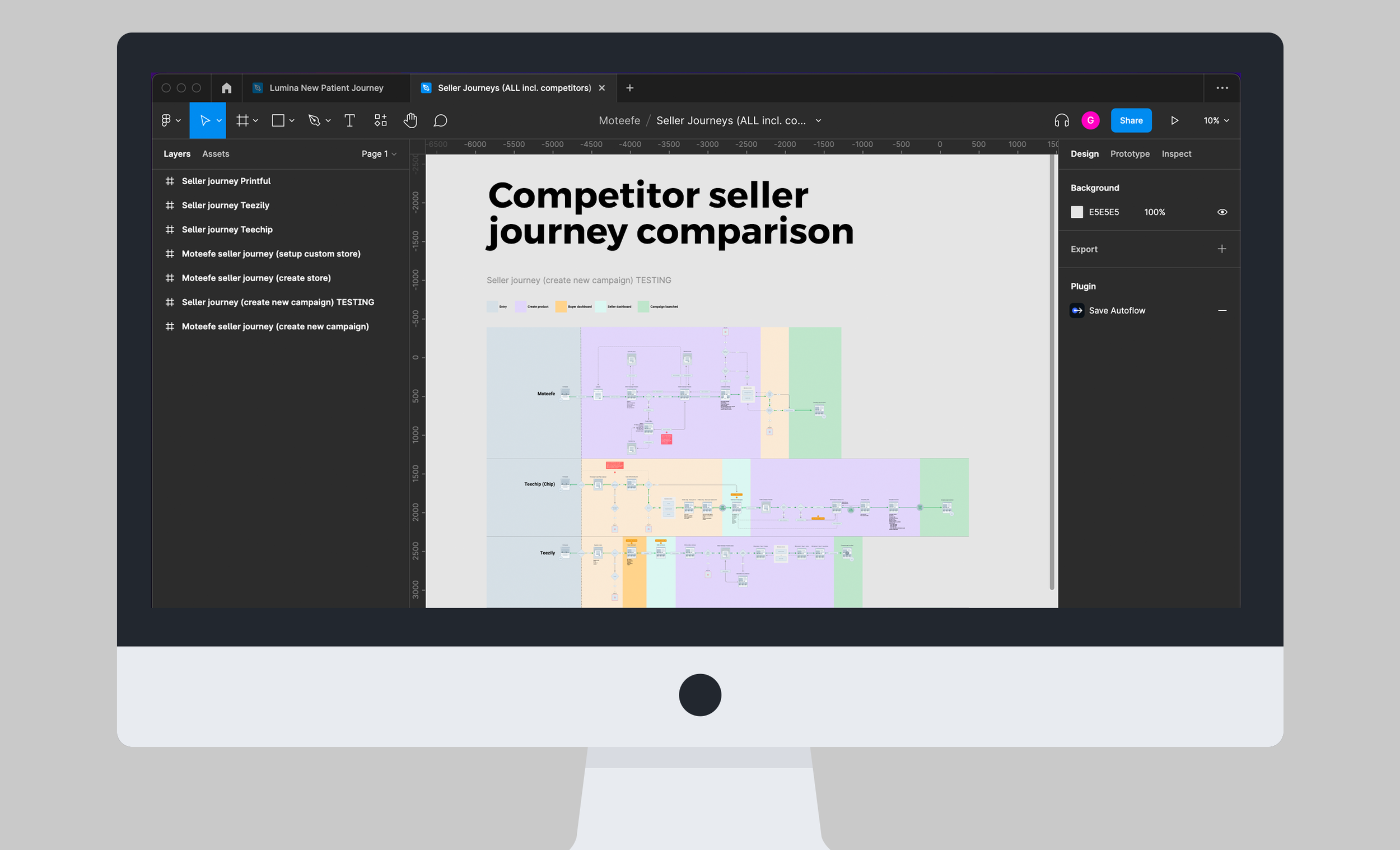
Before diving into the process of building our sellers’s personas, I started with some basics actions. So I set out to do some research into current best practices and experiences for sellers using e-commerce platforms to try and sell their products online. I wanted to identify some common approaches and themes. I compared these approaches with the our current Moteefe experience. I was interested in how different e-commerce dashboards were being presented, what was their onboarding process, how did different platforms communicate with their users (sellers), especially when the sellers originated in different markets and cultures.
TALKING TO REAL PEOPLE
Once I had done some preliminary research and a basic audit into our own Moteefe experience as a seller, I sat down to create a mixture of quantitative and qualitative surveys and interview questions.
We identified around 10-15 sellers who we felt would answer our survey and we contacted them and asked them to visit a link to a Google Survey. I had the survey translated into different languages
We sat down with 5 of our most successful and engaged sellers and interviewed them one on one. Sometimes this was in person, but mostly it was over a Zoom call. If the seller was a non English speaker, then I had our interview questions translated into the relevant language and checked by a native speaker before conducting the interview.
UNMODERATED TESTING: SELLERS ADMIN DASHBOARD
3) In addition to the seller interviews, I also created some remote unmoderated user test comparisons (with usertesting.com) on our sellers dashboard versus our biggest competitors. I created and wrote the scripts for users to follow, created some prototypes where relevant and I ran the tests in the US and the UK.
While these weren’t our core seller markets they nevertheless gave us some valuable and additional insights into how people used our admin dashboard.


The findings
From the preliminary research, our seller surveys, in-person interviews and our unmoderated user comparison tests, I now had a wealth of new information and insights to collate and distil into consumable chunks that I could present back to the product team and other internal stakeholders. I took all of the information and attempted to find common themes and narratives that were coming through. Using our quantitative data insights, I created graphs to give a visual overview of the sellers’ answers.
HIGH LEVEL OUTCOMES
The outcome of all of this was a fresh new understanding of what our sellers REALLY wanted to see from us in the coming months and where they wanted Moteefe to evolve so that we could support them properly in all areas of their entrepreneurial businesses.
Our sellers were used to reacting nimbly and quickly to the market and they expected Moteefe and our platform to do the same. As a result, Moteefe started to create a new strategic direction to support our sellers which touched on nearly all parts of the business and platform. One of the main pillars of this direction was a revamp of our sellers dashboard.
Sellers were in general happy with our products, our price points and the overall e-commerce buyers funnel. But where we were really letting them down was our sellers dashboard. We weren’t onboarding properly and we were missing important metrics and analytics that our sellers craved on a day-to-day basis. Or in some areas we had the metrics, but they were hidden behind information that sellers didn’t care about.
Sellers were constantly uploading designs and products and if something wasn’t working or selling they needed to react incredibly quickly using the data they had. The problem was we weren’t giving them the correct data at the correct times. Thankfully some of this was relatively basic and easy to fix. But other metrics and information was a bit harder to surface.
A huge pain point was that the current UX/UI and responsiveness of the dashboard needed a complete overhaul. This did however need to be balanced with some technical restraints of the current platform build.
The unmoderated user-testing exercise also helped to show that our competitors didn't have perfect seller and onboarding journeys either and that there were lots of confusing areas and potential friction points. This presented some really good opportunities for us to do it better than our competitors and move into a space where we could be the leaders rather than the imitators.
TIME TAKEN FOR PROJECT: 1 month
